Maintenance
Part of Magazine design, layout, and typography: a practical guide
Magazine design review checklist for print and digital editions
Magazine design review checklist for hierarchy, grids, type, contrast, images, captions, tables, ads, navigation, reflow, accessibility, print proofs, and release.
What to take away
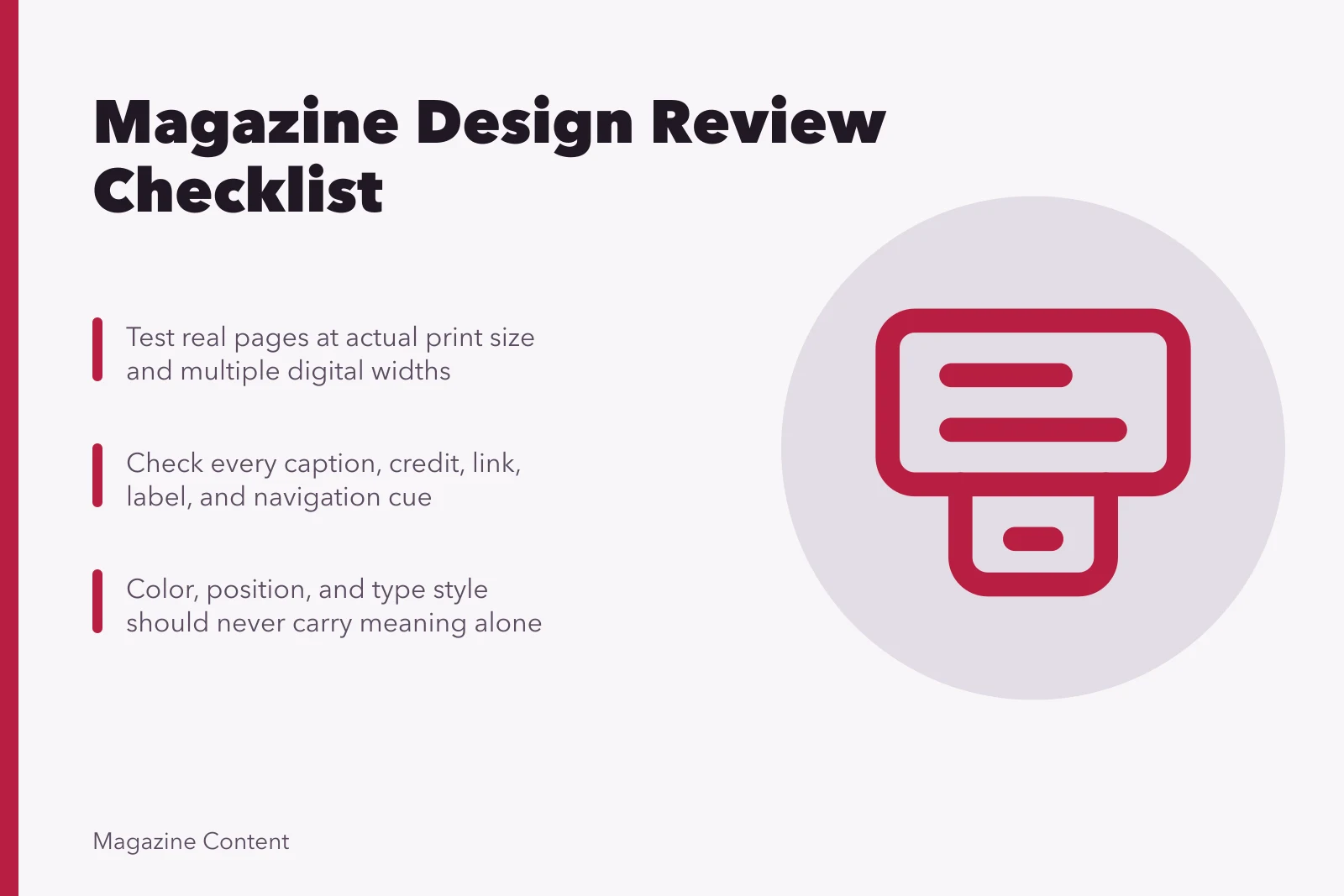
- Review editorial meaning, accessibility, and production together.
- Test real pages at actual print size and multiple digital widths.
- Check every caption, credit, link, label, and navigation cue.
- Color, position, and type style should never carry meaning alone.
- A late layout change can require another editorial and factual check.
Use this checklist after representative templates are built, after complete issue layout, and again on final proofs. Assign responsibility for editorial design, accessibility, print production, digital implementation, advertising separation, and release. A checked box should point to evidence or a named decision.
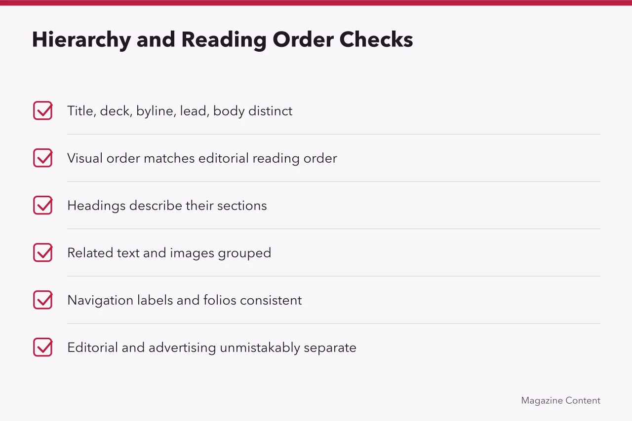
Hierarchy and reading order
- Article title, deck, byline, lead, body, headings, captions, and credits have distinct roles.
- Visual order matches the intended editorial and programmatic reading order.
- Headings describe the sections they introduce.
- Related text and images are grouped by more than proximity alone.
- Navigation labels, folios, section markers, and continuation cues are consistent.
- Editorial and advertising material are unmistakably separate.
W3C's introductory tips for designing accessible interfaces recommend sufficient contrast, not relying on color alone, clear interactive elements, consistent navigation, headings and spacing that group related content, and layouts that work at different viewport sizes. These principles apply to an article package as well as a service screen.
Typography
- Body size, line length, and line spacing support sustained reading.
- Hierarchy does not depend only on small differences in weight or color.
- Long passages avoid all caps, italics, condensed faces, and fine weights.
- Hyphenation, justification, widows, orphans, and rivers have been reviewed.
- Special characters, accents, fractions, and non-Latin text render correctly.
- User text enlargement and spacing changes do not clip or overlap content online.
Color and contrast
- Text is tested against its actual background, including images and gradients.
- Link, hover, focus, visited, error, and disabled states remain distinguishable.
- Charts use labels, patterns, or symbols in addition to color.
- Paper color, ink, coating, and show-through have been considered for print.
- Fine type is not built from fragile multicolor registration.
W3C's explanation of minimum text contrast gives a 4.5:1 ratio for ordinary text and 3:1 for qualifying large-scale text under WCAG Level AA, with defined exceptions. Check the rendered foreground and background rather than judging from a swatch name.
Images, captions, and data
- Crops preserve meaning and do not remove relevant context.
- Resolution, color space, profiles, and sharpening suit the output.
- Captions identify the correct subject, place, date, and action.
- Credits and rights notices are complete and legible.
- Alternative text or a suitable text equivalent exists online.
- Tables and charts retain labels, units, legends, sources, and notes.
Print proof
- Trim size, bleed, safe area, binding allowance, and crossover risk are checked.
- Folios, running heads, contents references, and jumps agree.
- Fonts are embedded or packaged correctly.
- Overprint, transparency, rich black, spot color, and total ink issues are reviewed.
- A physical proof is inspected under suitable light at actual size.
Digital proof
- Content reflows without loss at narrow widths and high zoom.
- Keyboard focus follows a sensible order and remains visible.
- Links and controls have clear names and adequate target areas.
- Sidebars, tables, galleries, and embeds remain usable without trapping readers.
- Performance does not delay essential text or cause disruptive shifts.
- Final content matches the approved editorial version.
Common questions
Does a print proof replace a screen proof?
No. Each reveals different color, scale, spacing, image, and production problems.
Should every page use identical spacing?
Use a shared scale, then choose the appropriate interval for each relationship.
Who checks ad separation?
Name an editorial or standards owner rather than leaving the decision only to sales or design.
What happens after a late crop or headline change?
Return the changed element to the relevant editor, rights owner, checker, and proof stage.