Features
Part of Magazine design, layout, and typography: a practical guide
Case study: redesigning a fictional magazine feature for print and web
A fictional quarterly rebuilds one 12-page feature: six-column grid, reset body type, captions as components, and a web edition that reflows.
What to take away
- The original spread offered five competing entry points and no stable reading path.
- A six-column print grid yielded halves, thirds and full-width measures from one system.
- Body type was reset only after real copy was set at final size and printed.
- Captions became components with fixed caption, credit and maximum-width rules.
- The web edition kept reading order and meaning instead of replicating the spread.
This is a fictional case. The publication, article, images, names and measurements are invented. The two W3C references are real; nothing here is a conformance claim.
The feature being rebuilt
The fictional quarterly City Material runs a 12-page feature on public benches. The opening spread carries a centered title, two angled pull quotes, a full-bleed photograph, a map inset and a translucent text box. Body pages switch among two, three and four columns with no pattern a reader can learn. Captions appear in three styles.
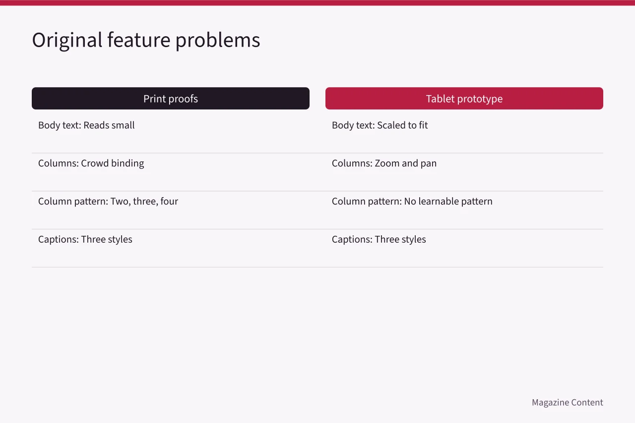
On paper proofs the body text reads small and the inner columns crowd the binding. On a tablet prototype the team scales the whole spread to fit the screen, so readers zoom and pan. At 400 percent browser zoom the replica scrolls in two directions for ordinary paragraphs.
List the jobs before drawing anything
The editor and designer write out what the feature has to do, then assign each job to a place on the page:
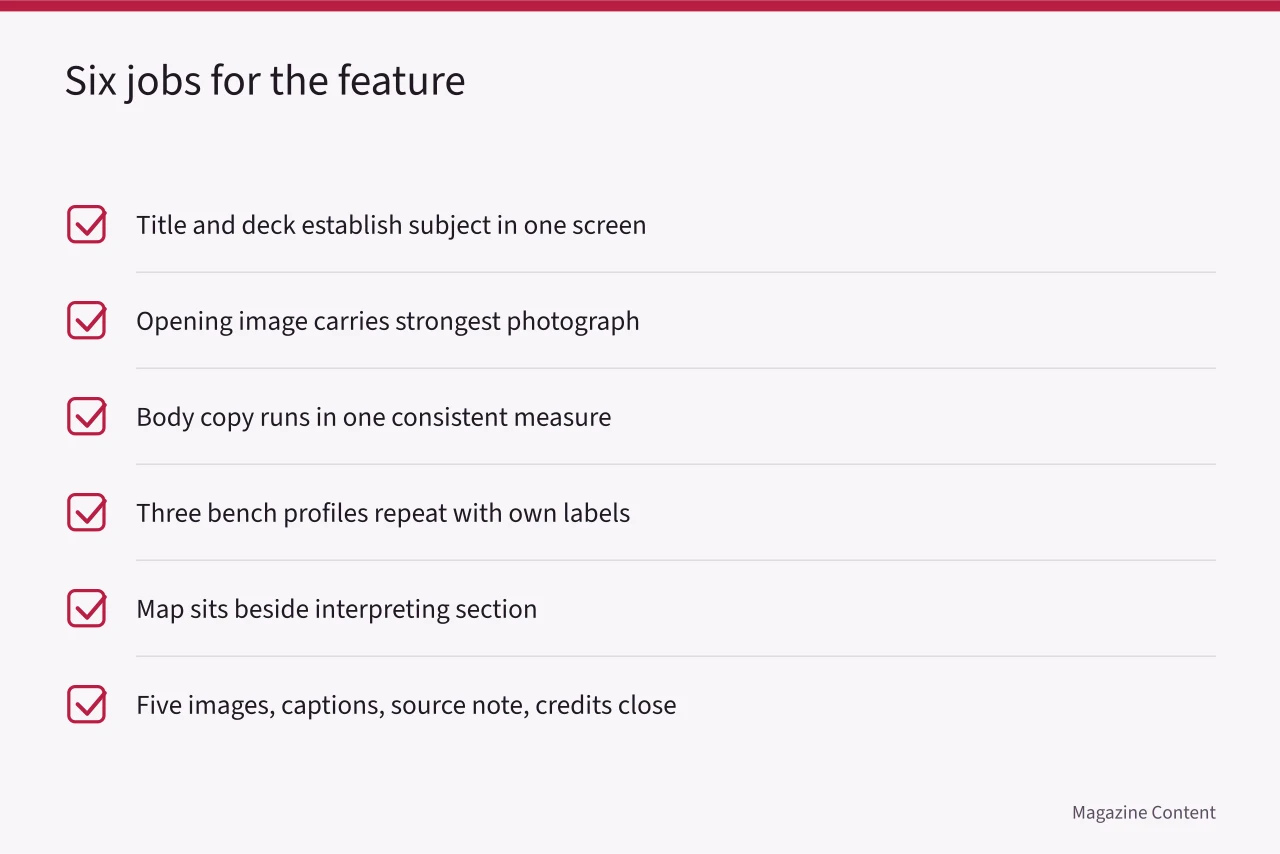
The angled pull quotes repeat the deck, so they go. That frees the opening spread for the photograph and the deck alone.
W3C's explanation of content reflow frames the digital problem: ordinary reading content should adapt at narrow equivalent widths without two-dimensional scrolling, while genuinely two-dimensional material such as a map or data table can get its own contained treatment.
The print grid
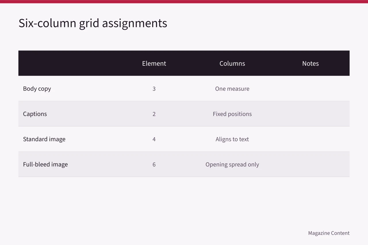
The designer sets a six-column grid. Body text takes three columns, captions two, large images four or six. The inner margin grows so text clears the binding. A baseline rhythm aligns running text; the map key and captions keep line spacing suited to their smaller size instead of snapping to the baseline.
Placeholder text hid the real problem. Once actual copy was set at final size and printed, the body face went up a step and its measure narrowed. The lead gained line spacing and lost a color that added nothing. The source note moved from pale gray to a darker neutral.
Show the numbers
| Body copy | 3 |
|---|---|
| Captions | 2 |
| Standard image | 4 |
| Full-bleed image | 6 |
Captions and image treatment
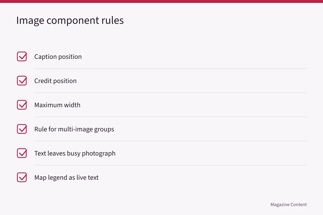
Every image component now carries a caption position, a credit position, a maximum width and a rule for multi-image groups. Text leaves the busy opening photograph and sits in a solid area.
One crop was rejected because it removed the bench user whose presence explains the caption.
The map legend was rewritten as live text rather than baked into a low-resolution image.
The web edition
The web article uses semantic heading order, one primary reading column and full-width media where it helps. Profile sections stack at narrow widths. The map sits in a horizontally scrollable region with a text summary beside it. Captions follow their images in source order, and decorative quotation marks are hidden from assistive technology.
W3C's guidance on visual presentation of text sets out why adjustable colors, line width, alignment, spacing and resizing matter for readers with low vision or cognitive disabilities. The team does not claim its defaults must copy every listed value. It checks that readers can enlarge and adapt the text without the layout breaking.
Worked example: what the proofs caught
The first print proof showed a caption sitting too close to the trim and dark images losing separation on uncoated paper. Both were corrected before the second proof. Digital testing found a profile label detached from its heading at narrow width, and a focus outline hidden under a sticky share bar. Component spacing and bar position were revised.
The accepted design uses fewer display gestures than the original. Print and web now share hierarchy, type roles, image relationships and caption language without pretending a spread and a responsive article are the same object.
Common questions
Why six columns rather than four?
Six divides into halves, thirds and full width, which covers this feature's body measure, caption width and two image sizes from a single system. Four columns forced awkward half-measures for captions.
Why not reproduce the spread online?
A fixed spread makes ordinary text hard to enlarge and read across viewports. Keeping the spread as a picture also strips the text of its structure for screen readers.
Can a map scroll in two directions?
When two-dimensional layout carries meaning, a contained scrolling region can work, provided the surrounding article still reflows. Give the map a text summary so the information survives without it.
Did the redesign reduce creativity?
It concentrated visual difference where it supported the editorial material. The opening photograph and the profile unit carry the design; the body pages stay quiet and readable.