Rules
Part of Magazine design, layout, and typography: a practical guide
Magazine layout and typography problems with practical fixes
Magazine layout fixes for weak hierarchy, long lines, cramped leading, brittle grids, clipped text, contrast, detached captions, forced fitting, and broken reflow.
What to take away
- Hierarchy fails when too many elements demand first attention.
- Type problems should be solved through the whole text setting, not font size alone.
- Fixed-height boxes are especially brittle when text changes or enlarges.
- Captions and credits need visible, structural attachment to their images.
- Copy should not be silently rewritten to rescue a fragile layout.
Layout trouble shows up late because templates get tested with short placeholder text and ideal images. Diagnose the rule behind the failure before nudging one element. If several pages break the same way, revise the system instead of collecting exceptions.
Problem: everything looks important
Fix
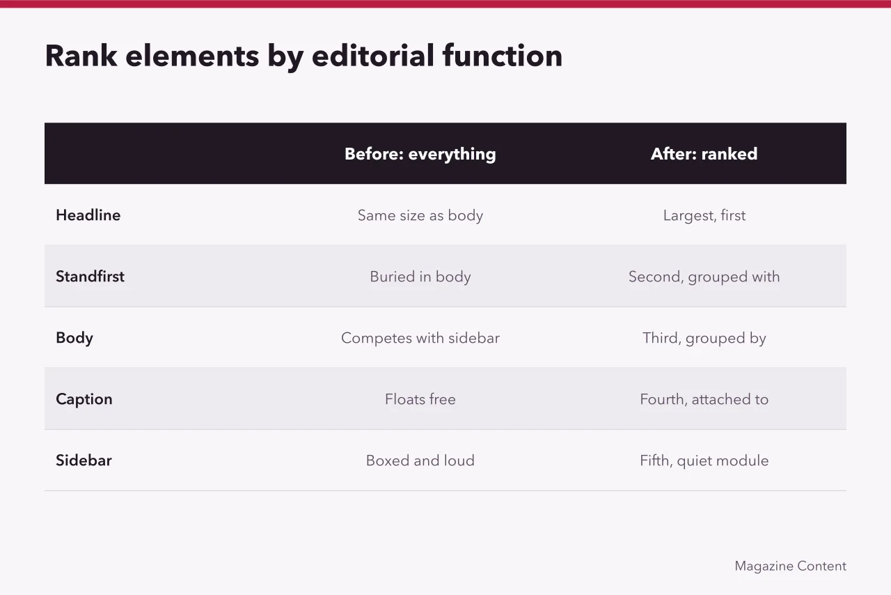
Count what competes for first attention on a spread. Then cut the count. Rank elements by editorial function: headline, standfirst, body, caption, sidebar. Use spacing and position to group them before adding rules or boxes.
Problem: body copy feels dense
Fix
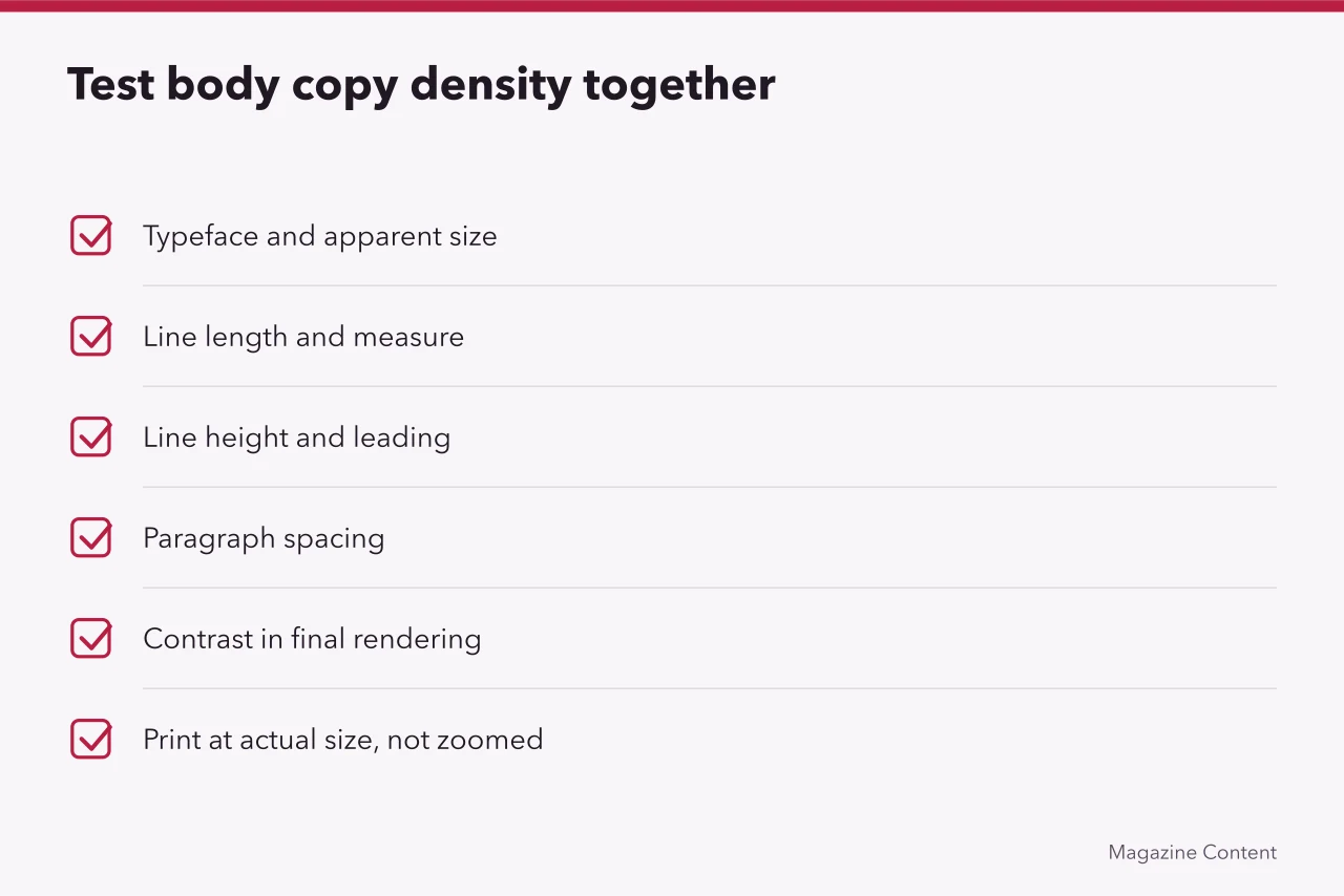
Test typeface, apparent size, line length, line height, paragraph spacing and contrast together. More leading will not repair a very long measure. Enlarging type inside a fixed container buys constant hyphenation. Print at actual size; a zoomed canvas lies about density.
Problem: enlarged text clips or overlaps
Fix
Remove fixed heights from text containers and let components expand. W3C's guidance on text-spacing adjustments requires marked-up content to tolerate specified increases in line, paragraph, letter and word spacing without losing content or function. Test headings, buttons, cards, captions and pull quotes, not only body paragraphs.
Problem: a photo makes text unreadable
Fix
Choose a quieter crop, move the text, add a solid background, or separate image and copy. A translucent overlay fails whenever the photograph changes underneath. Measure contrast in the final rendering, and check the treatment still preserves what the image was chosen to say.
Problem: caption and image become separated
Fix
Place caption and credit inside the image component. Hold one alignment and block page or column breaks that strand either element. Numbering helps complex figures; nearby unrelated images still need unambiguous labels.
Problem: responsive order contradicts visual order
Fix
Start with logical source order, then use layout rules to arrange wide screens. The UK Home Office manual on layout and typography recommends clear, consistent layouts, readable fonts, left alignment, headings and a reading order that stays coherent as content is resized and reflowed.
Worked example: a spread that breaks three ways
A feature runs to four columns of 38 characters, set in a fixed-height card. The card clips at 200% text size, the caption floats to the next page, and the pull quote lands before the paragraph it quotes.
- Widen body text to two columns and drop the fixed height.
- Move caption and credit inside the image component.
- Reorder source so the pull quote follows its paragraph.
Three edits, one afternoon, no copy lost.
Problem: copy is cut to fit without editorial review
Fix
Return the passage to an editor with the space available and the deadline. Tightening display text is usually harmless. Deleting a qualification, a response, a unit or a source note changes meaning. Record every wording change and recheck it.
Problem: the grid produces narrow fragments
Fix
Combine columns for reading text and reserve narrow modules for brief labels. Add an approved wide component rather than squeezing everything into the smallest unit. Ask whether the grid reflects real content or only a tidy wireframe.
Common questions
Is fully justified text always wrong?
No. It needs a suitable measure, language-aware hyphenation, careful spacing and proof review. Set it badly and the rivers show on press.
Can type sit over any image with an overlay?
No. Contrast, subject interference, crop changes and small-screen behaviour can all fail. Test the worst image in the set, not the calmest.
Should designers edit copy to fit?
Only within agreed authority. Meaningful cuts need editorial review and often another fact check. A silent trim that drops a qualification is a correction waiting to happen.
What is the first responsive test?
Read the page in source order, then narrow and enlarge it while watching for loss, overlap and confusing sequence. Fix the template, not the page.